When it comes to minimalist design, color may not be the first thing that comes to mind, but it plays a crucial role in creating a harmonious and impactful aesthetic. As a seasoned designer, I’ve witnessed firsthand how the strategic use of color can elevate a minimalist space from stark to stunning. In this article, I’ll delve into the fascinating world of color theory and its application in minimalist design, offering insights and tips to help you master the art of balancing simplicity with vibrancy.
Understanding Color Theory
When it comes to minimalist design, color theory plays a crucial role in creating a visually impactful space. Understanding the basics of color theory can help designers make informed decisions on color palettes and combinations. Here are some essential points to consider when working with color in minimalist design:
- Color Wheel: Familiarize yourself with the color wheel to comprehend the relationships between different colors, such as complementary, analogous, and triadic schemes.
- Psychology of Color: Each color carries its own psychological significance, influencing emotions and perceptions. Utilize this knowledge to evoke specific moods in your design.
- Value and Intensity: Pay attention to the value (lightness or darkness) and intensity (brightness or dullness) of colors, as they impact the overall visual balance of a minimalist space.
- Monochromatic Schemes: Embracing a monochromatic color scheme can add depth and sophistication to a minimalist design while maintaining simplicity.
- Accent Colors: Selecting a strategic accent color can create focal points and visual interest within a minimalist setting.
By mastering these principles of color theory, I can elevate the aesthetic appeal of minimalist spaces and achieve a harmonious balance between simplicity and vibrancy.
The Psychology of Color in Design
Understanding the psychology of color is crucial when it comes to design. Colors have the power to evoke emotions and influence moods, making them a vital aspect of minimalist design. Here are some key points to consider:
- Red: It symbolizes passion and energy, making it ideal for adding a bold touch in minimalist spaces.
- Blue: Known for its calming effect, blue is often used to create a sense of tranquility and serenity.
- Yellow: Represents happiness and positivity, making it a great choice for bringing warmth to minimalistic interiors.
- Green: Symbolizes growth and harmony, perfect for creating a connection with nature in minimalist designs.
- Black: Often associated with sophistication and elegance, black can add a touch of drama to minimalist spaces.
By utilizing the psychological effects of different colors, designers can intentionally create atmospheres that resonate with individuals on a subconscious level. This understanding allows for the creation of minimalist spaces that not only look appealing but also feel harmonious and balanced.
Implementing Colors in Minimalist Spaces
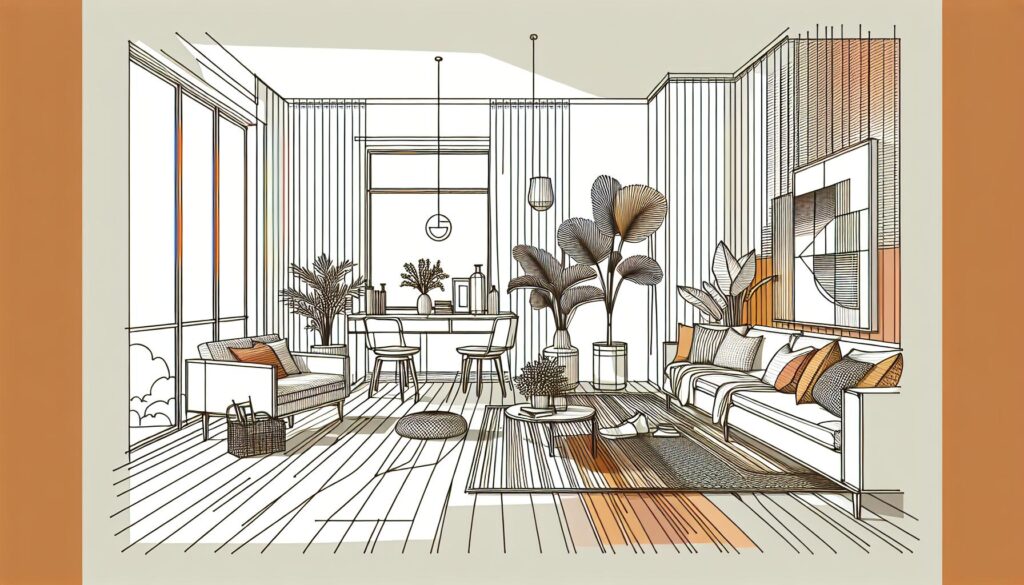
When implementing colors in minimalist spaces, it’s crucial to maintain a sense of balance and harmony. I opt for a limited color palette to create a cohesive and serene environment. Select a primary color as the foundation and accent it with one or two complementary shades for visual interest.
In my experience, white is a popular choice for minimalist spaces as it exudes simplicity and cleanliness. It serves as a versatile backdrop that allows other colors to pop. Incorporate neutral hues like beige, gray, or taupe to add warmth and depth to the space without overwhelming the senses.
When introducing color accents, I recommend exploring bold choices like emerald green or deep navy to create a focal point or inject a sense of drama. Use these colors strategically in accessories or statement pieces to maintain the minimalist aesthetic while adding a touch of personality.
Remember, less is more in minimalist design, so avoid overwhelming the space with too many colors. Stick to a cohesive palette and focus on the impact of each hue. By implementing colors thoughtfully, you can enhance the visual appeal of your minimalist space while maintaining its clean and harmonious vibe.
Creating Contrast and Harmony
When it comes to minimalist design, creating contrast and harmony through color choices can truly elevate the space. By using opposite shades on the color wheel, you can achieve a striking contrast while maintaining a sense of balance. For example, pairing a light gray with a dark charcoal adds depth and visual interest without overpowering the simplicity of the design.
To enhance harmony, consider tonal variations within the same color family. Mixing different shades of white or beige can add dimension and warmth to the space while keeping the overall look cohesive. Subtle contrast in hues can create a sophisticated and polished aesthetic in minimalist interiors.
Another way to introduce contrast is through the use of accent colors. Selecting a bold accent like midnight blue or mustard yellow can draw attention to specific areas of the room and inject personality into the design. These accents should be used sparingly to maintain the clean and uncluttered feel of a minimalist space.
In minimalist design, contrast and harmony work hand in hand to create a visually appealing and balanced environment. The strategic use of color can highlight architectural features, define spaces, and evoke different moods within the room. By experimenting with different color combinations and balancing visual impact, you can transform a minimalist space into a welcoming and stylish retreat.
Key Takeaways
- Understanding Color Theory: Familiarize yourself with the color wheel, psychology of color, value, intensity, monochromatic schemes, and accent colors in minimalist design.
- Psychology of Color in Design: Colors like red, blue, yellow, green, and black have unique psychological effects that can influence emotions and moods in minimalist spaces.
- Implementing Colors: Maintain balance by using a limited color palette, incorporating white as a backdrop, adding neutral hues for warmth, and strategically introducing color accents.
- Creating Contrast and Harmony: Utilize opposite shades for contrast, tonal variations for harmony, and bold accent colors to define spaces and enhance visual appeal in minimalist design.
Conclusion
Color plays a pivotal role in minimalist design, offering endless opportunities to create contrast, harmony, and depth. By strategically selecting colors that complement each other, minimalist spaces can exude sophistication and style. Whether it’s through tonal variations within the same color family or the introduction of bold accent hues, color has the power to transform a space into a welcoming sanctuary. Embracing the principles of minimalist design while harnessing the potential of color can elevate any room, highlighting its unique features and setting the tone for a harmonious environment. So, remember, when it comes to minimalist design, the right color choices can make all the difference in achieving a space that is both visually appealing and functionally efficient.